
Tired of keyboard collabs that are just a new color and a character logo? The CHERRY MX3.0S PRO Eevee keyboard takes a different route. It treats the whole main key area as a single canvas instead of a row of separate stickers. Below, we look at its artwork layout, lighting, and print craftsmanship, then ask whether it deserves the title of desk art.
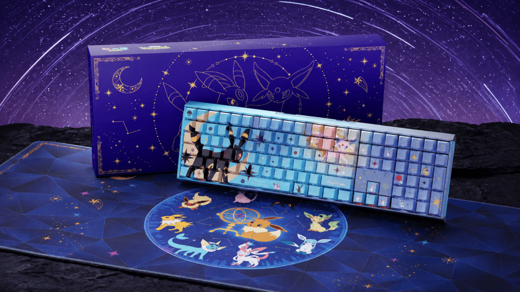
Artwork: When Sun and Moon Cross the Keycaps
Most Pokémon keyboards follow the same recipe: swap the case color, print a character face on a few keycaps, and call it a collaboration. This design breaks that habit.
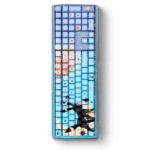
The Core Visual: Umbreon and Espeon Face to Face
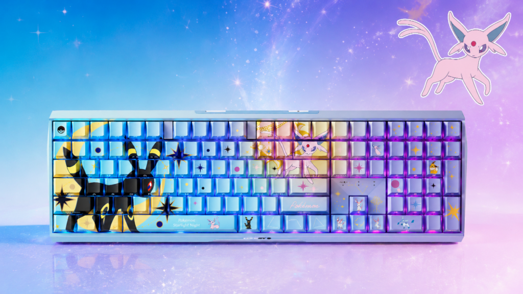
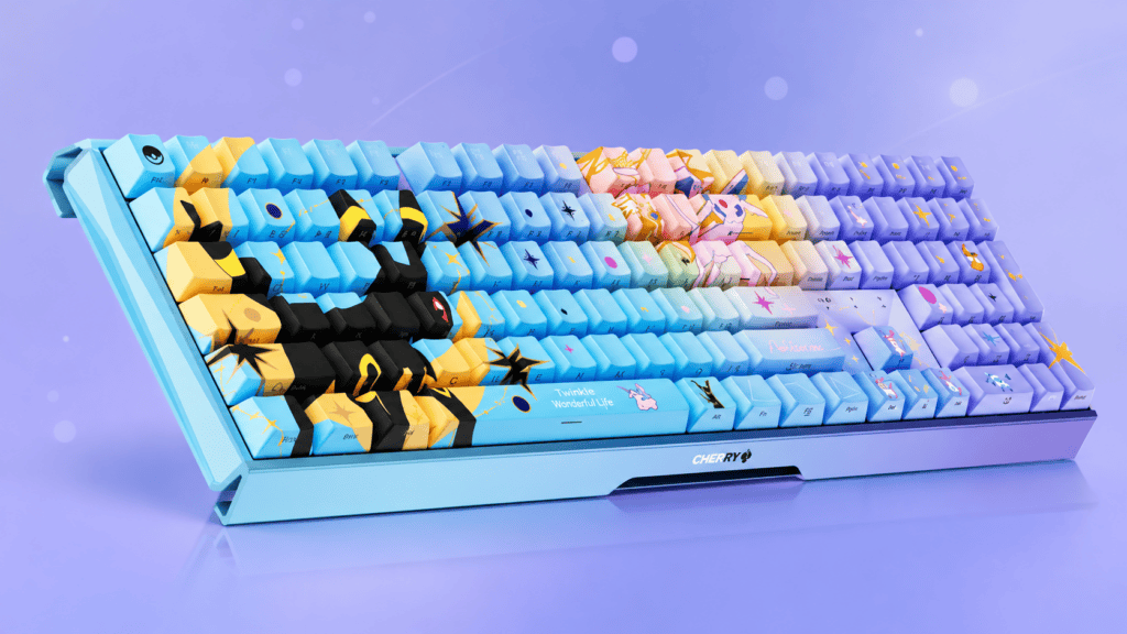
Traditional collab keycaps are limited by the size of a single 1U or 2U key. A cross-key design has to work around the gaps between keys, so the artwork reads as one image across the whole key matrix.
- Main key area as the stage: Umbreon and Espeon face each other across the alphanumeric block.
- Dark meets light: Night answers day, which gives the center of the keyboard a story and a sense of motion.
- Planned around the gaps: Each key gap is accounted for in the layout, so the seams read as part of the composition.
Scattered “Stardust”: The Other Eeveelutions
The rest of the board is not left empty.
- Edge integration: Eevee, Sylveon, Glaceon, and other forms appear across the function row and numpad.
- Order within the chaos: They sit in the corners and gaps with relaxed poses instead of being boxed into single keys.
- Hidden-easter-egg feel: The board stays clean as a typing tool, and every glance down becomes a small search for details.
Lighting and Craft: Starry Night, Sealed In
A cross-key design depends on two things: light that brings it to life, and a print process that keeps it intact.
Why “Eevee and Starry Night” Works
The Eevee family has a rich color palette, and a dark base lets those colors stand out. Paired with an RGB starry-night backlight, the deep tones recall a night sky.
The Glow Between the Keys
In a dark room, RGB light leaks through the gaps and softens the edges of the keycap art.
- Light from beneath the switches creates a gentle halo across keycap edges.
- Character outlines and star-like accents seem to float over the gaps.
- The Umbreon–Espeon scene becomes a glowing silhouette against the night instead of a flat picture.
PBT Five-Sided Dye-Sublimation: Art That Lasts
Complex cross-key artwork would wear out quickly with UV printing or surface coatings. This is why PBT dye-sublimation keycaps matter.
- How it works: Under high heat, solid dye turns to gas and penetrates the PBT plastic.
- The result: The image is infused into the keycap instead of sitting on the surface.
- Feel: There is no raised coating, just a dry, fine-matte texture.
- Color: Saturation is high. Umbreon’s subtle glow and Sylveon’s soft pastel gradients both stay clear.
- Durability: Even with heavy daily use, including WASD-heavy gaming, the characters resist blurring from wear.
For a board meant to be displayed as much as used, that durability keeps the art looking good over time.
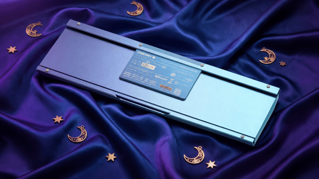
Evolution and Verdict: Is It Truly Desk Art?
From Character Posters to a Full Scene
CHERRY released an Eevee collaboration in 2022. That design worked more like a merchandise set: individual Eevee faces on separate keys, or a few special keycaps forming a small standalone image. It looked good, but it was still a pile of printed keycaps.
The cross-key approach changes that:
| Aspect | Earlier Approach | Cross-Key Puzzle |
|---|---|---|
| Layout logic | One character per key | One scene across many keys |
| Visual focus | Individual keycaps | The entire main key area |
| Storytelling | Collection of characters | Unified narrative (day vs. night) |
| Design mindset | Merchandise | Display-worthy art |
The table shows the shift in thinking: the design now starts from the whole keyboard, not from the single keycap.
The Verdict
- Visual impact: The Umbreon–Espeon face-off breaks the rigid, boxy look of a keyboard and gives the main area real tension.
- Craft and durability: Five-sided dye-sublimation makes the art both beautiful and long-lasting.
- Design progress: It shows that key gaps don’t have to hurt the image. They can work as natural dividers inside it.
Overall, this collaboration goes beyond fan-service keycaps. It tests how far a mass-produced keyboard design can go, and it has the presence to become the focal point of a desk. For those who care about performance as much as looks, the CHERRY MX 3.0S Pro 8K page is a good place to explore the platform behind this kind of keyboard.
 English
 German
 Portuguese
 Spanish
 Italian
 Finnish
 French
 Japanese
 Korean
 Swedish